Close
Cartwheel has long been a trusted name in hospitality talent recruitment, supporting hotels, contract catering, pubs, bars and restaurant groups with high-quality staff, while also serving as a valued partner in executive and senior leadership search.
Over time, the business has increasingly focused on executive placements, evolving into a senior-level search and advisory specialist to the hospitality sector.
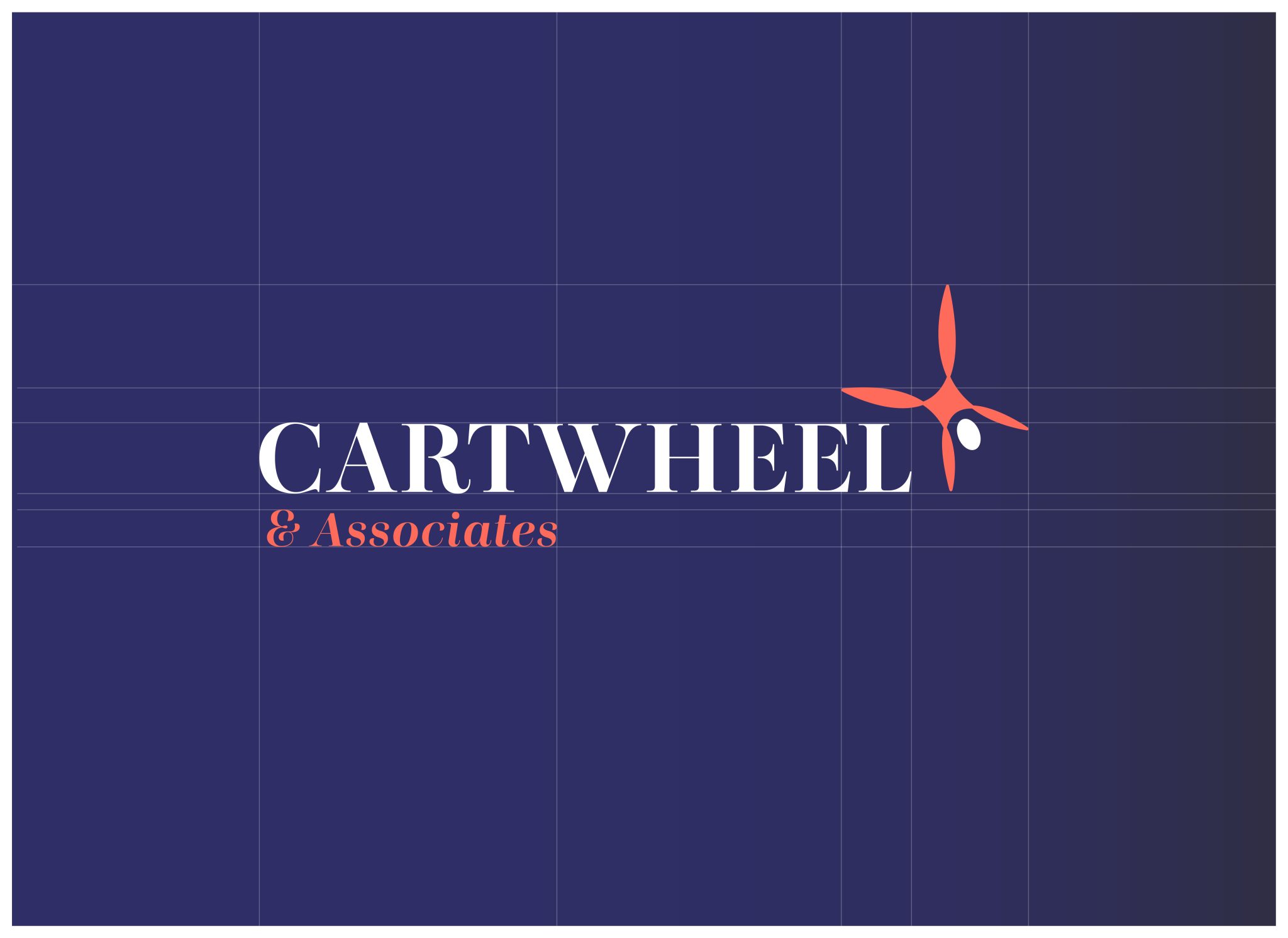
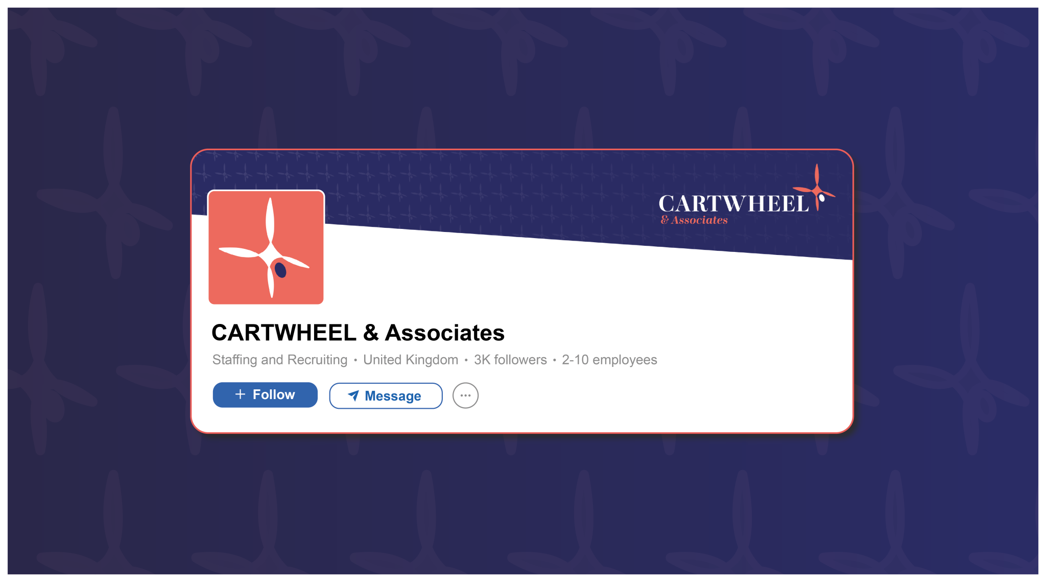
To reflect this repositioning, the company name evolved to Cartwheel & Associates with the ‘& Associates’ acknowledging both the wider network of recruitment specialists delivering day-to-day hiring, and the broader consultative services to be led by Hannah herself. From culture and HR to strategic recruitment planning, the rebrand needed to match a more advisory, partnership-driven approach.
This wasn’t a reinvention, it was a refinement. The brand needed to evolve in step with the business, while still holding onto the essence of what made Cartwheel trusted and distinctive. That balance, between continuity and change, mirrored the way Hannah approached the organisational shift itself.
The market is changing. Cartwheel, therefore, needed to restructure and rebrand so that we can continue to serve our clients and candidates better. Hannah Horler, Managing Director, Cartwheel
There were three principles we were guided by in this branding exercise:
These would act as the design ‘north star’ in all of the decisions we made.
Made’s creative team started the process by exploring fonts and typography. We were searching for something that had the class and elegance befitting Cartwheel’s position and clientele, but with a nod to the company’s history. This discounted any sans-serif fonts, which are great in a more modern context, but didn’t quite have the refinement we were seeking.
Eventually, we settled on Presti Display, which not only had the desired elegance but exuded a confidence that was a perfect match for the company’s strong market position.
We also felt that, whilst Presti Display was a serif font, it did not feel ‘old’ or dated, instead showing a timeless quality that sits in the sweet spot between modern and traditional.
To accommodate the tweak in the company name in the wordmark, we italicised ‘& Associates” to add a sense of craft, reflective of Cartwheel’s experts.
Presti Display would not be suitable for longer-form communication, so Lexend – optimised for legibility and ease of reading at speed – was chosen as the secondary font.
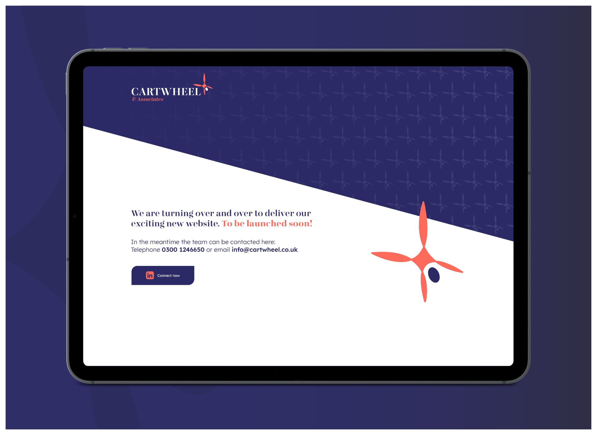
With the typography established, we turned our attention to colour. Deep navy was chosen as the foundation; a confident, composed tone that speaks to the professionalism and quiet authority of Hannah and the Cartwheel team.
To balance it, a bold hot coral injects warmth, energy and character, delivering the perfect expression of Hannah’s presence and the human relationships as the beating heart of the business.
Supporting tones of dusty aubergine, sea mist blue, and softened sage green, other similar neutrals were introduced to add depth and versatility, ensuring the palette could flex confidently across digital and print, to be refined, never flat.
“If I had to capture Hannah Horler into a colour, it would be hot coral; bright, bold, unmissable. It’s a tone that radiates warmth and energy, just like she does, and it sings when paired with the grounding navy. The supporting palette softens things beautifully: timeless, heritage shades like sea mist and sage bring a sense of calm confidence, a nod to Cartwheel’s experience, depth, and understated elegance” Andy Purton, Strategy Director, Made Agency
‘Careful evolution’ is also how we approached redesigning the logo. The existing mark – an encapsulated cartwheeling figure – had coherence with the brand name, which it had represented so well for many years. So whilst there was an acceptance that the figure needed updating, there was no appetite to lose it completely.
Lots of exploration and experimentation led the creative team to devise a more abstract cartwheeling figure. A simpler form, more figurative than literal, but one which felt more dynamic. A kinetic and moving figure, now named Propel, it’s always in forward motion but retains the human at its core.
“Propel is great because it still nods to the original cartwheeling figure that everyone was so fond of but with a greater feeling of speed and progression. It also offers us lots of flexibility for future creative applications” Dave Collier, Creative Director, Made Agency
The shift from Cartwheel Management Recruitment to Cartwheel & Associates doesn’t scream change; it breathes clarity. It was important that the rebranding took a similar approach and that the final result echoed this refinement. What we have created is something elegant, sophisticated and human that works as well for social media as it does for board-level pitch decks.
“This wasn’t about starting from scratch, as the foundations were already in place. Our role was to take Hannah’s vision and give it the coherence, direction and creative expression it deserved. Everything we built had to honour what came before, but speak directly to where the business is heading. We’re proud of the collaboration in delivering a brand that reflects the same focus, energy and intent that Cartwheel & Associates brings to everything they do in serving their sector.” Andy Purton, Strategy Director, Made Agency
"I have worked with Andy and Dave for many years, so it was an obvious decision to ask them to work on the rebranding of Cartwheel.They have always had a deep understanding of the business and its position in the marketplace. I knew they would have an empathetic approach and fully understood the direction and vision I had for the evolution of the brand. I’m thrilled with the outcome; they have captured it perfectly!" Hannah Horler, Managing Director, Cartwheel
If you’ve made changes to your business recently, does your branding and messaging still align?
Perhaps you’re planning changes but would like a coherent approach that includes your brand look, feel and assets.
With years of cross-sector experience in rebranding – whether it’s a refresh or something more substantial, Made can help.
Contact the Made team today.


.png)